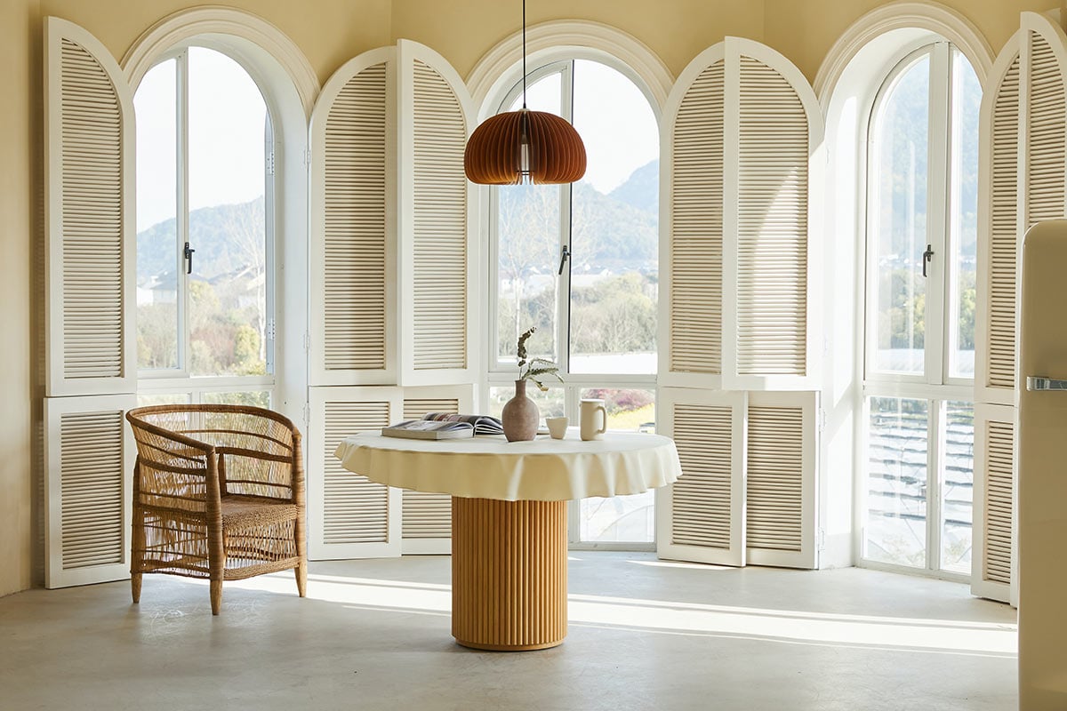
I walked into a friend’s newly renovated living room last year expecting to be dazzled by the price tag. Instead I got dazzled by something else. Nothing in the room was shouting. No gold everything. No logo-covered anything. Just good proportions, a restrained color story, and a handful of pieces clearly built to last decades instead of seasons.
That’s the part most “how to look rich” articles get backwards. Expensive-looking spaces are usually quieter than cheap-looking ones. Not louder.
If that’s the effect you’re after, here’s what actually moves the needle, and what’s just noise dressed up as advice.
Materials first, decoration second
Budget space versus luxury space, the biggest tell is material quality, and it’s not even close. Solid wood beats veneer. Real stone beats laminate. Linen beats a polyester blend that pills after three washes. You can feel the difference before you can explain it, which is exactly why it registers as “expensive” even to people who couldn’t tell you why.
You don’t need marble on every surface. You need to be deliberate about where the real stuff shows up. A solid oak dining table. A genuine leather sofa. Brass hardware instead of the plated finish that flakes within a year. Spend where your hands and eyes make contact daily, and relax about the rest.
Color restraint matters more than people think
Walk through a luxury interior and count the colors. Three to five, usually, often just variations within one family rather than a handful of competing hues fighting for attention. That’s not an accident. A tight palette reads as considered. A loose one reads as accumulated. That’s the actual line between “curated” and “shopped-for.”
Warm neutrals have stuck around this long for a reason — cream, taupe, soft greige, warm white. They age well and they don’t clash with whatever you add six months from now. Bold color still belongs in a luxury room. It just tends to show up once, deliberately, instead of scattered everywhere.
Scale is the thing nobody explains properly
Here’s something designers know that rarely makes it into a decor blog: rooms that feel expensive almost always have furniture sized right for the space. A sofa that’s slightly too small for a big living room looks cheap no matter what it cost, because the empty space around it reads as unplanned. Cram oversized furniture into a small room and you get the same problem in reverse.
Fix is simple, just under-discussed. Measure the room. Measure the furniture. Leave enough negative space that the room can breathe. Most designers aim for something like 60 to 70 percent of the floor filled, tops, with the rest left open for movement. That empty margin is doing more visual work than people give it credit for.
Lighting needs layers, not a single fixture
One overhead light and nothing else is the fastest way to make any room feel like a rental. Real luxury spaces layer it: ambient light for general use, task lighting where you actually need it, accent lighting on art or texture or architectural detail. Table lamps. Floor lamps. Picture lights. Even under-cabinet lighting in a kitchen. Each one adds warmth a single flat ceiling light can’t touch.
Dimmers are the cheapest upgrade with the biggest payoff here. A $15 switch that lets a room shift from bright and functional to warm and low changes how expensive it feels at 9pm versus noon.
Fewer objects, chosen better
This is the hardest habit to actually build, because the instinct to fill empty surfaces is strong. Luxury spaces get edited, not accumulated. One well-chosen vase on a console table reads as intentional. Five mismatched trinkets on the same surface reads as clutter, no matter what any single piece cost.
Before adding something to a room, ask if it earns its spot. Not whether you like it, whether it earns its spot. A single coffee table book picked for its cover and weight will do more for a room than three random decorative objects grabbed because they were on sale.
Texture carries more weight than color does
A room done entirely in one flat texture, even in a perfect palette, tends to feel oddly cheap. Texture is what gives a room depth. Bouclé chair against a linen sofa. Chunky knit throw over a smooth leather ottoman. Jute rug under a glass coffee table. The contrast between rough and smooth, matte and glossy, does a huge amount of the “expensive” perception. Often more than the actual price tag on any one item.
Where the money should actually go
Tight budget? Spend on the pieces you touch and see constantly. Sofa, bed, dining table. These get used daily and scrutinized closely. Statement lighting comes right after — a genuinely well-designed pendant does more work per dollar than almost anything else in a room, since it’s usually the first thing the eye finds.
Save on the rest. Accent pieces, seasonal decor, anything easy to swap later. Nobody’s judging your throw pillows the way they’re judging your sofa.
Bottom line
Luxury home decor isn’t really about spending more, even though spending more obviously helps. It’s about restraint, proportion, and honest materials. Those cost attention and taste far more than they cost money. A well-edited room with good bones will beat a room stuffed with expensive things that don’t relate to each other. Every time.
FAQ
Do I need to hire an interior designer to get a luxury look? Not necessarily. A designer helps most with proportion and layout, which is genuinely hard to judge in your own space. Material choices, color restraint, editing down clutter — all of that you can handle yourself.
What’s the fastest, cheapest way to make a room look more expensive? Layer your lighting, add a dimmer, edit clutter down to a few intentional pieces, and check that your furniture is actually sized right for the room. All four cost little and change a lot.
Is luxury decor the same thing as minimalism? No, though they overlap. Minimalism means very little. Luxury decor means the right things, which can include layered textures, art, collected pieces, as long as each one earned its place instead of just showing up.